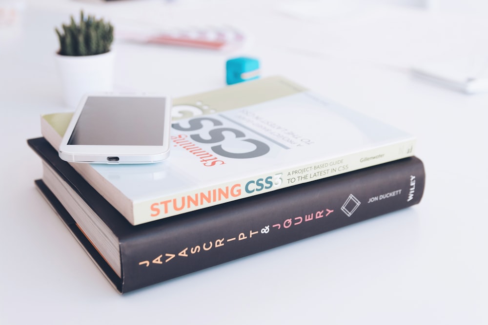
The hardest part of web development isn't the logic; it's centering a div. Just kidding... sort of. While building Vyntax, I relied heavily on two CSS superpowers: Grid and Flexbox.
When to use Flexbox?
I use Flexbox for 1-dimensional layouts. For example, the Navbar on this site uses display: flex with justify-content: space-between.
When to use Grid?
Grid is for 2-dimensional layouts. The Tools Section of Vyntax uses CSS Grid to create responsive columns that adjust to screen size automatically.
Stop fighting with floats. Embrace modern CSS layout engines!